The term “heat map” has become increasingly confused. Perhaps it doesn’t matter, but for the record the above map is a choropleth map. It’s been branded by Google (as one of the Google Gadgets) with the sexier label “heat map”, and this (mis)usage is catching on. The term heat map is already equivocal. First, as a non-geographic, non-map representation, the heat map is a treemap-like graphical technique used to represent a two-dimensional array of data.
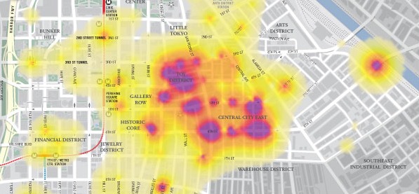
As a cartographer, though, I’ve always (well, ok, for a year or so anyway) taken heat maps to be a thematic mapping technique in which a (typically) diverging, (usually) thermal-like color scheme is used to represent density in a continuous fashion. Like the following (from Cartifact’s Downtown L.A. homeless map).
This technique holds the use of color (well, value or lightness really, not hue) in common with choropleth mapping. That is, they share the same visual variable (though, as noted, heat maps almost always utilize a diverging color scheme, in which both hue and value/lightness are varied). The difference is that choropleth maps represent data by enumeration units (countries, states, counties, blocks) while the heat map technique is continuous and not aggregated to enumeration units.
As I say, perhaps it doesn’t matter, and I’m not really advocating that Google Gadgets users (and others) learn the term “choropleth map”. Indeed, I’d be just as happy with the also-misleading term “color map”, as at least it does not already stand for two different symbologies.
3 Comments
Excellent point and well-stated.
There are choropleth maps and isopleth (surface) maps. Both can utilize color-coded intervals (using contours for the latter) but each has different properties and therefore associated usage caveats.
Then then there is the issue of using color in map making - or as Mark Monmonier (’How to Lie with Maps’) put it: “Color is a cartographic quagmire”! Now it is easier than ever to produce colorful but misleading, if not out and out erroneous, maps.
Alan MacEachren told me among the info viz community, “heat map” is a common term for what we know as a simple choropleth map.
We should probably fight those guys.
Also check out our diffent.com/heatmap service…no programming required.
Or, drive it from JavaScript or PHP.
We just call it a heatmap because of common usage, but normally we think of this as a color contour plot (without the contour lines drawn, but implied by color change).
3 Trackbacks
[...] be aggregated to grid squares; it could also be shown with a continuous density representation like this style of heatmap. Tagged baseball, pitch location, sportsviz, visualization [...]
[...] creation of Heat Maps. The best way to understand what they are is to see them: You can also take a look at this post from one of my favorite blogs on what is and what is not a heat map. Well for long time I wanted [...]
[...] or properly cloropleths, are a popular visualization technique which seemed appropriate here. However, I also want each [...]