a JavaScript library for thematic mapping in OpenLayers
At last October’s NACIS Practical Cartography Day I gave a very sweaty presentation that was later described as bewildering and incoherent. I had always meant to partially redeem myself by packaging and cleaning up the code that formed the basis of that talk. And here it is!
OL-Symbology is just a small JavaScript library for easily creating 5 basic thematic map types dynamically in OpenLayers: choropleth, proportional symbol, cartogram, dot density, and isoline. Each basic symbology includes many options for customization, and symbology classes can be combined to create multivariate thematic layers. Below I’ll go through the background and specific features of the library; if you just want to check out the code, head over to the Github page for the project.
Impetus
OpenLayers has been around for six years now, and really is the most fully-featured web mapping platform going. I’d argue that it’s been used mostly for reference mapping, as opposed to thematic data mapping. I first saw OL used for thematic mapping in choropleth and proportional symbol applications in 2008. I added noncontiguous cartograms to the mix last year.
These previous implementations, though, were all written and presented more or less as “one offs”. That is, they weren’t packaged up as classes to be re-used by other developers; rather they were all more proofs of concept. I wanted to expand and develop a library of classes that would allow end developers or cartographers to easily create basic thematic mapping types with very little code. Before getting into the library, I need to mention the one previous attempt I know of to do pretty much the same thing: the MapFish widgets for choropleth and proportional symbol mapping.
MapFish is a RIA framework for web mapping that uses OpenLayers as its map engine. I saw the two MapFish thematic mapping widgets mentioned in the 2008 post by Bjørn Sandvik on choropleth mapping with GeoJSON, and I’m really not sure that any work has been done on them since then. Though the MapFish widgets are quite limited — only one color scheme for choropleth, no classed choropleth or unclassed proportional symbols, only one shape type available for proportional symbols — I did borrow some ideas from the format and organization of the two widgets. Before talking about the five individual thematic mapping types in my library, I’ll just go through a bit of what they hold in common.
Common features
To create a new thematic layer, the user/developer only needs to set three options:
- url or layer: a data source, in the form of a URL string or a pre-loaded Vector Layer
- indicator or valuator: the name of the variable (attribute/indicator) that you are representing with this symbology. If you need to standardize your variable (ex. disease cases divided by population) just define the optional valuator function
- map: the Map instance that the thematic layer should be added to
All other symbology settings are optional and have at least semi-intelligent defaults. So, most basically:
url : 'geothermal.geo.json',
indicator : 'temp_depth_75km'
});
That would create a completely serviceable isarithmic representation and add it to your map, though you’d likely want to customize it by at least setting the isoline interval option (the default is 5; see below).
Each thematic map type has unique options (colorScheme for choropleth, maxSize for proportional symbols, etc.); but they share a few classification options: classed, numClasses, classification method, and classBreaks. The classification method is currently limited to quantiles or equal interval, though any breaks can be applied by setting the classBreaks option. Below I’ll just touch on the 5 thematic map types and the symbology options that can be applied to each.
Symbologies
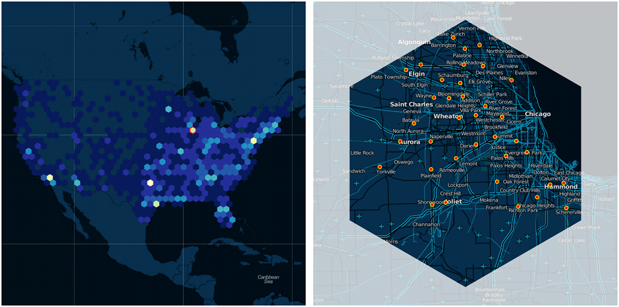
Choropleth
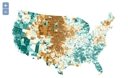
Choropleth is one of the most basic thematic mapping types, and was the first I programmed for this library. To add a choropleth layer to your map, the only required options are the indicator and url:
url : 'counties.json',
indicator : 'unemployment'
});
To create a more custom representation, the class includes many different symbology options:
url : 'counties.json',
indicator : 'unemployment',
classed : true,
numClasses : 6,
method : ol.thematic.Distribution.CLASSIFY_BY_QUANTILE,
colorScheme : 'GnBu'
});
The color scheme “GnBu” is the name of a ColorBrewer color scheme. All of the ColorBrewer schemes are available just by referencing their reference name. Alternatively users can set the colors property to any custom colors they’d like.
One property not shown above is the colorStrokes boolean. If set to true, feature strokes will also be colored. While this can be applied to polygonal features in a traditional choropleth map, it is perhaps most useful in applying a choropleth symbology to isolines or other linear features (see “multivariate symbologies” below).
Here’s an advanced example that shows most of the options available in the Choropleth class.
Proportional Symbol
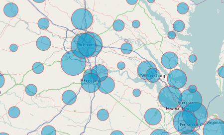
Proportional symbols are another basic representation of a quantitative dataset, and can be created just as simply as choropleth layers (above). As with all other symbologies, proportional symbols may be classed (graduated) or unclassed. Symbols themselves can be circles, squares, or triangles; the correct area will be applied no matter what shape is chosen. Similar to the colorStrokes property of the Choropleth class, the ProportionalSymbol class includes a sizeStrokes option that allows feature strokes to be sized instead of feature areas. This property is most useful in multivariate applications (for example, sizing the strokes of isolines to represent the value of each isarithm).
A unique feature of this library is that it allows for perceptual scaling of proportional symbol features. Back in they heyday of psychophysical research in academic cartography, a lot of studies showed that map readers routinely underestimated the size of areal symbols. To correct for this, symbols can be scaled up by an exponent derived from a power function designed to estimate the relationship between actual and perceived size of symbols. For academics and other researchers interested in tweaking the power function exponent, this can be set with the powerFunctionExponent option (the default is the .8747 average derived from James Flannery’s touchstone 1971 study). Most users should just ignore perceptual scaling and use the mathematical default.
Perceptual scaling and other options are shown off in this advanced example of the ProportionalSymbol class.
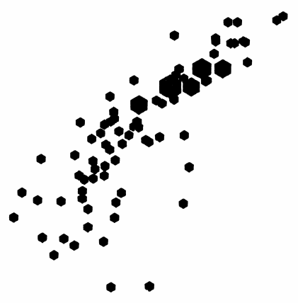
Noncontiguous Cartogram
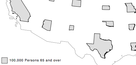
I’m kind of a fan of noncontiguous cartograms — I’ve written about them here, here, and here. My noncontiguous cartogram class just extends the ProportionalSymbol class, so all options (besides shape; see above) for prop symbols are also available for cartograms (classification, perceptual scaling, etc.).
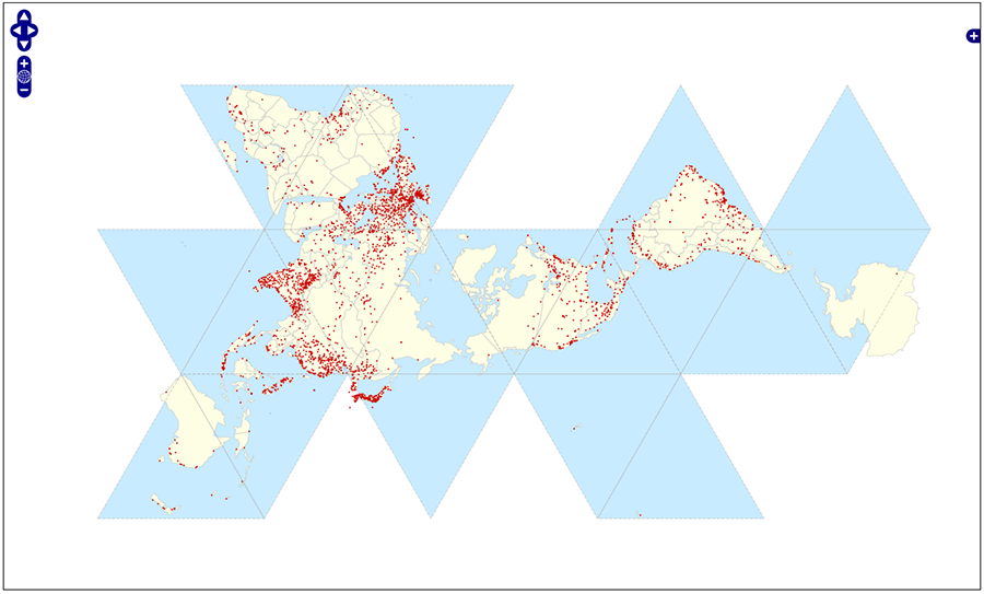
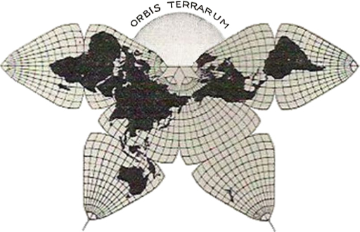
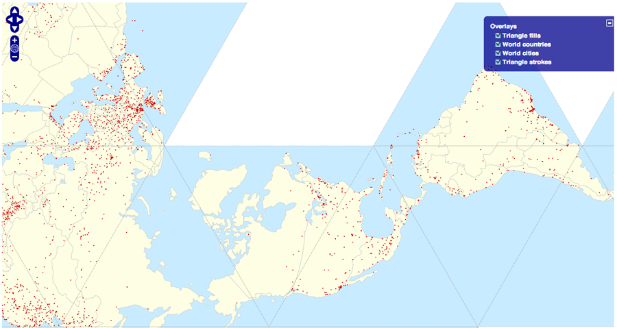
To see the Cartogram class in action, check out this example. And as before, I created a reproduction of the iconic noncontiguous cartogram from Judy Olson’s touchstone study of the form.
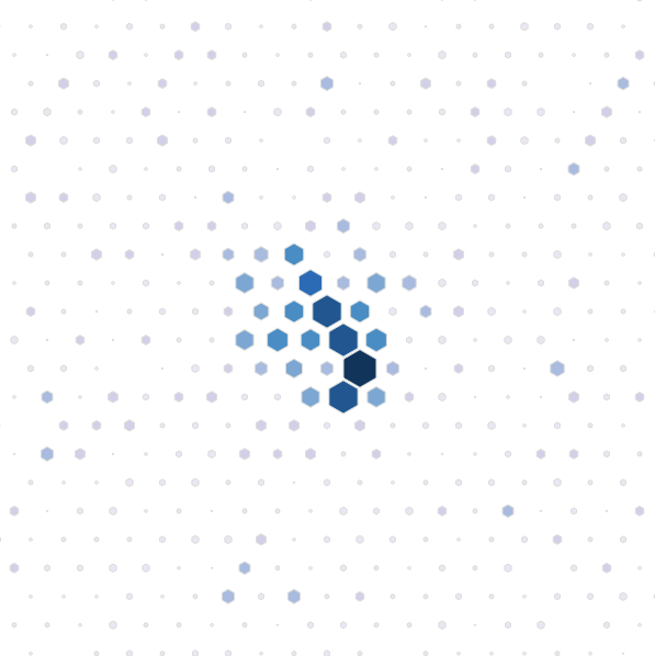
Dot Density
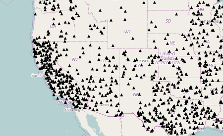
Another basic textbook thematic symbology is dot density, in which dots are randomly scattered across polygons in numbers according to their indicator value. The dotValue option controls the ratio of dots to indicator units, and thus the number of dots on the map. The dot size (as well as dot shape) can be set on the defaultSymbolizer object — a style object that each symbology class has that controls non-data related styling properties of the representation. View the source of this example for more.
You may notice that the dot density representation takes a while to process. The basic strategy for creating a dot density layer is to figure out how many dots need to be placed for each polygonal feature, and then to place those dots randomly within the bounds of the features. To accomplish this goal, dots are randomly placed within the bounding box of each feature and then tested to see if they actually lie within the feature. Though this requires some processing, it doesn’t need to be as slow as the current implementation in this library. It is slow only because I decided to use the built-in containsPoint method of the OpenLayers Polygon geometry class. This point-in-polygon method requires that random points be tested one-at-a-time; a much faster strategy (the one Andy and I used when developing this symbology for Indiemapper) is to use a points-in-polygon test that can test many points at a time. Eventually I’ll implement that method here but for now this class should work plenty fast with a small number of features and relatively high dotValue.
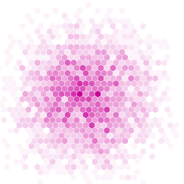
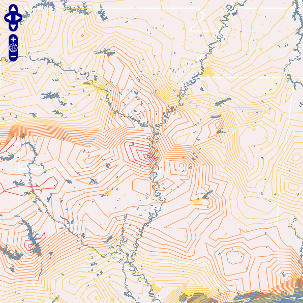
Isolines
Making your browser interpolate isolines is fun! I first did these in ActionScript 3 back in 2008. This JavaScript version works essentially the same way: generating a triangulated irregular network (TIN), interpolating isoline interval values along each triangle edge, and then connecting these interpolated points to form lines of constant value (isolines). See my older post for more description of the basic method. Check out this simple example of the OL-Symbology Isoline class.
The only options available to customize your isoline representation are interval (the distance in attribute space between lines) and showTIN (whether to show the triangulated irregular network used to interpolate the isolines). As described in the next section, you can also apply choropleth and proportional symbologies to your isolines after creation.
Multivariate symbologies
These thematic mapping classes were written in such a way that they can be easily combined to form bivariate and trivariate representations. Of course, this only makes sense with certain symbology combinations; and map readers are bad enough at interpreting univariate symbologies that increased complexity should rarely be attempted. But for those rare cases, OL-Symbology can be used like so:
var cartogram = new ol.thematic.Cartogram( map, {
url : url,
indicator : indicator,
requestSuccess : function( request )
{
choropleth = new ol.thematic.Choropleth( map, {
indicator : otherIndicator,
layer : this.layer
});
}
});
That would create a noncontiguous cartogram and then color the features with a choropleth color scheme, accepting all defaults; see the example. There are a few things to note in the above. The requestSuccess method can be defined on any symbology object — it is called only once, when remote features have been loaded and processed. The choropleth class is instantiated in the above without a url option — that is because the features have already been loaded from the remote URL. Instead of defining the URL the layer option is set to the layer property of the cartogram representation. Interestingly, the exact same representation would be created by reversing the order and first creating a choropleth representation, and then sizing the features using a cartogram representation.
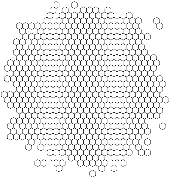
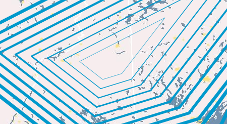
The same strategy was used to create the image at the top of this post of colored isolines. You can see a basic colored isolines example here. Other possible symbology combinations include proportional symbol + choropleth, dot density + choropleth, isolines + proportional symbols, and proportional symbol + proportional symbol (where the 2nd instance of the ProportionalSymbol class would apply to the proportional symbols’ strokes).
Limitations and next steps
When I presented this work last October, I also showed off a very similar library I’d written that works with Polymaps instead of OpenLayers. Those classes still need some work, and I’ll blog about them separately. The OpenLayers version I’m presenting here is really pretty full-featured, including basic and advanced options for all symbologies. This version is limited to OpenLayers, but the dependencies aren’t that deep so most of the code could be modified to work with another JavaScript mapping API.
Most classes are decently fast, with dot density being the only one I’d hesitate to use in production; but I’ll add my own point-in-polygon method to the dot density class soon. I hope the library is useful to at least a few others, either in pedagogical or production contexts. And it’s BSD licensed so do whatever you want with it!