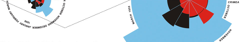
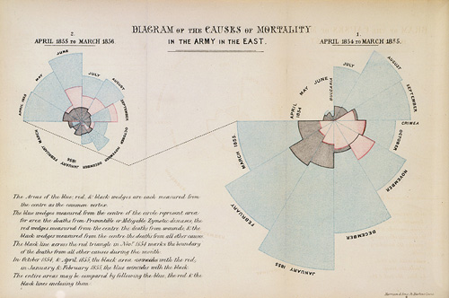
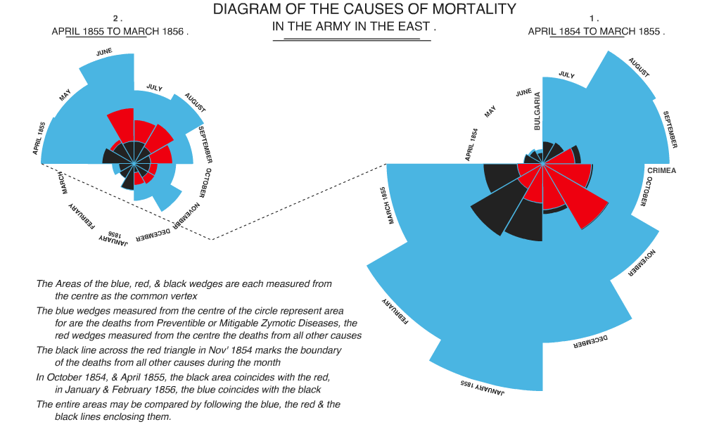
I’ve long been a sucker for the polar area/coxcomb/rose charts popularized by Florence Nightingale. These multivariate charts can show ordered or unordered categorical data. As noted in an Economist piece on influential information graphics,
As with today’s pie charts, the area of each wedge is proportional to the figure it stands for, but it is the radius of each slice (the distance from the common centre to the outer edge) rather than the angle that is altered to achieve this.
I wanted to produce some just for kicks, so looked around for a script in AS3. No dice. OK, any language? Didn’t see anything. So I sat on the idea for a while and then finally thought up the technique that made producing them in AS3 quite easy. With the resultant classes, producing graphics like the following small multiples of U.S. soldier deaths in Iraq is a snap. The classes are written in AS3, so can be used with Flash, Flex, or mxmlc. All the example screenshots below are PNGs captured from SWFs produced with only AS3 (extended Sprites). To see the code (which includes a lot of ugly annotation), click ‘view source‘ below any image. All source code is included in the ZIP distribution linked below.
U.S. Soldier Deaths in Iraq, March 2003 to October 2008
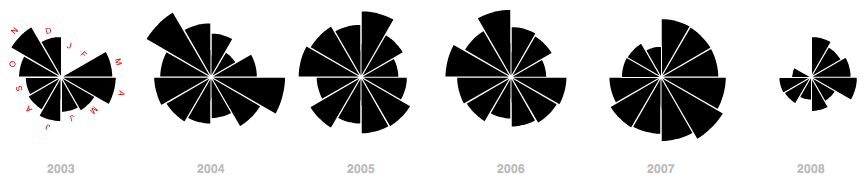
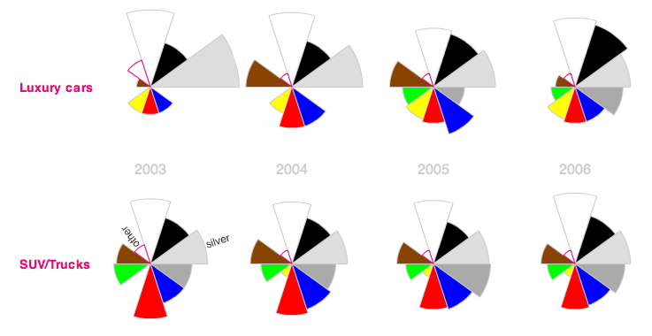
The above chart series utilizes the coxcomb in the same manner as Nightingale’s original — as a month-by-month temporal chart. The following is also a small multiples presentation, but utilizes categorical coxcombs to show car color popularity by percent manufactured.
Cars manufactured by color, 2003 to 2006
And as the ultimate test for the classes, I decided to try my hand at reproducing Nightingale’s original graphic. I relied on Hugh Small’s beautiful reproduction of Nightingale’s graphic. I quickly gave up on reproducing the fonts, and indeed a few of Nightingale’s embellishments/idiosyncrasies are not reproduced in my graphic. But one of these nights I’ll extend the class to more faithfully reproduce Nightingale’s original. Nevertheless, not bad eh?
I’m open to the criticism that these coxcombs (and other area-based symbologies) are rarely preferable to a simple bar chart (a length-based symbology). But I still believe they ought to be a part of the information designer’s toolkit, especially as they hold definite advantages over their more popular offspring, the pie chart. For animated or small multiples applications in particular, the coxcomb is preferable to the pie chart because of the constant position/angle of slices. It’s easy to glance across a series of small multiples coxcombs, or watch an animating coxcomb, and follow individual slices. I’ve built basic interactivity and tweening (using Grant Skinner’s lightweight GTween Engine) into the class. See this discussion over at Edward Tufte’s site for some of the advantages and disadvantages of coxcomb charts.
Further, though bar charts may be easier to read, they may not work in all contexts, including interactive mapping, in which compactness may outweigh other concerns.
Here’s an example of some of the basic tweening and interactive capabilities of the class.
When I initially thought of coding these charts, I balked at the idea of constructing slices whose relative areas would faithfully represent the data. But I eventually realized that I could just use masked circles. The circles could be accurately scaled to the data, and since each segment would mask the same percentage of the circle, the resultant pie slices would faithfully represent the data. The technique (demonstrated in the diagram below) has the added advantage of allowing tweening of slices in animated displays.
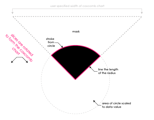
the main technique behind CoxcombChart.as — the masking and rotation of CoxcombSlices
A bit easier said than done, since the strokes on each slice need to be drawn. But that boils down to geometry. Each slice need only be rotated into place to form the final rose chart.
I’ll create a few more examples in the future — I’m particularly interested in the cartographic applications of this multivariate chart. I’ll likely post a Modest Maps layer showing coxcomb charts of average precipitation-by-month for major cities, or something, in the near future. For now, here’s all the code used to produce the graphics above. It should be pretty easy to produce a coxcomb chart of any data using this code, and my interface is flexible enough to modify the appearance and interactivity of the charts for most applications. But feel free to extend the class and override methods to alter these properties.
- A ZIP of the full distribution. This also includes Grant Skinner’s lightweight GTween Engine (a single .as class) which is required for the class. Andy Woodruff’s DashedLine class is also included, as it is used in the Nightingale example.
- For you browsers, view all the source here
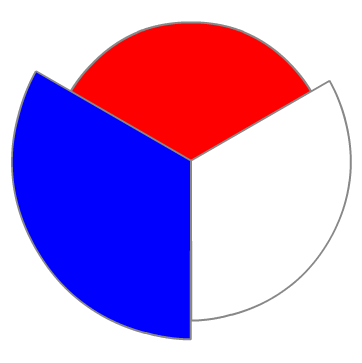
Creating the coxcombs should be pretty easy. Here’s an example instantiation of a non-interactive coxcomb, 350 pixels wide/tall, with 3 slices, each a different color.
[
{ label : 'red', value : 15 },
{ label : 'white', value : 20 },
{ label : 'blue', value : 25 }
],
350, [ 0xff0000, 0xffffff, 0x0000ff ], 0x888888
);
39 Comments
These look great! It’s interesting that you went with a masked circle for the Coxcomb slices. We did a bunch of experimentation with arcs and circles for Digg Arc, and ended up going with a parametric curve model, generating portions of circles by drawing tiny straight line segments instead of masking larger shapes. The way yours tweens is super hot.
There’s a good critical post about Nightingale’s Rose here, including some alternative charts of the same information:
http://dd.dynamicdiagrams.com/2008/01/nightingales-rose/
And Tufte and his contributors have smart things to say here:
http://www.edwardtufte.com/bboard/q-and-a-fetch-msg?msg_id=00007o
@Michal — Thanks!! Yeah I shied away from a curve model just b/c
1. I figured manually drawing the curves would be difficult
2. This method got me tweening pretty much out of the box
3. Scaling can be applied quite simply to the circles
That said, I still had to do a bit of maths to draw/tween the radius lines and initially construct a large enough mask to accommodate changes to the size of each slice.
@Tom C — Thanks for the link. Had no idea Nightingale’s slices were incorrectly scaled by radii. I still think a case can be made for using (correctly scaled) coxcombs in visualizations and dashboards. Though bar charts may be easier to read, coxcombs can be more compact with a large series of data (potentially important in multivariate mapping applications). The circular form of the coxcomb may better suggest the cyclical nature of some temporal datasets. And all 2D areal symbologies can better handle data with high and low extremes than 1D linear symbologies like the bar chart.
@zach’ry - you might like these graphs from a survey of urban rail use given to me by my friend Mike Frumin: http://mike.teczno.com/img/passenger-rail-graphs.jpg. I think the axis labels are legible in that camera phone shot. it’s a wonderful of example of two separate dimensions implying a second meaningful dimension: X-axis shows how far people go, y-axis shows how crowded they are, and the two together result in passenger-miles. It’s lovely how all the areas are lined up in a row so you can make inferences over a group of cities as well.
I just fixed a small bug in the code that was occasionally causing labels to be hidden by slices in the tweening example above. ‘View source’ and the ZIP distribution are updated, as is the SWF for the example above.
@Michal - agreed, those are sweet. Had seen this kind of bivariate symbol before, occasionally with the combined area actually meaning something, but never arrayed as a bar graph in descending order of one of the variables. What a great minimalist design.
It’s totally off-topic, but I should say that your blog is really awesome.
Most of us Flex and Flash guys are so focused on technology and most of us just blog about issues in the technology (which is important, when googling in the last hours before delivery) or trying to educate beginners.
We all strive to impress each other with our super duper complex apps and we kind of forgetting that Flash have grown to a point that it is really powerful in data visualization, and instead of doing stunning stuff, we can search for and share with others the most effective and intuitive ways to visualize tons of data.
The focus of your blog really impressed me!
Fantastic blog! I am part of a project involved with understanding uncertainty, and we came across your notes after we had also produced animated versions of Nightingale’s charts (see http://understandinguncertainty.org/node/213 ). I am sorry that we did not learn of your work earlier, as we would have loved to make use of your tools. We have provided links to your blog which I hope are suitable. Anyone who doubts the effectiveness of polar area charts as an impressive means of communicating data should be referred to this convincing blog.
Incidentally, we do not believe that Nightingale’s charts were drawn incorrectly. The data she used to generate her charts can be found on our web-site.
списки кандидатов, выдвигаемые партиями политическими и избирательными объединениями (блоками) на выборах в представительные органы, проводимые по пропорциональной избирательной системе.
As a mostly visual designer I’m interested in using ActionScript to increase the accuracy of my infographics, so I’m delighted to see your examples and have access to the AS files. I really appreciate your work. But, as a beginner programmer I just not advanced enough to implement it myself. I’m wondering if you provide the FLA and SWF files for these examples.
!
I just registered an account here….
I really love the atmosphere on this site. .
Is it hard to become a mod on this forum?
I wrote this recent post
Florence Nightingale, with her coxcombs, had an amazing impact that has continued to inspire tens of millions of people around the world. To check out the article “Florence Nightingale: Mother of Nursing”, click on http://bit.ly/agInhG
“~, I am really thankful to this topic because it really gives great information `-’
It’s how you can tell if the is actually working or not.
You really make it seem so easy with your ppost!
I like your post. Good job!
Howdy! I just wishes to give you a big “thumbs up”. . ! for the fantastic data you have here. I’ll be returning to yuor web blog to get more in the future.
Normally I do not read post on blogs, however I would like to say that this write-up very forced me to check out and do it! Your writing taste has been surprised me. Thanks, quite great post.
Some really interesting points you have written.Helped me a lot, just what I was searching for : D.
Real instructive and good body structure of subject matter, now that’s user pleasant (:.
Outstanding post, you have pointed out some good points , I too believe this s a very excellent website.
I am delighted that I observed this weblog , precisely the right info that I was searching for! .
I’d constantly want to be update on new content on this website , saved to my bookmarks ! .
Some genuinely superb content on this internet site , thanks for contribution.
Yes, that is normal behavior: the browser window needs to have focus before it can respond to keyboard events.
Have you had the experience of looking for a car only to end up feeling frustrated and overwhelmed by the process?
It may be just be the case that you need some solid advice
beforehand. The information included here can
simplify the entire process of purchasing a car.
IndieMaps have such well written articles inspite of the content being so difficult to elaborate on.
You don’t must dread spending all of cash once you go buying. You can get the understanding it takes to hold on to funds whenever you use supercuts coupons appropriately. You just require to learn exactly where to discover the correct supercuts $5 coupon. Study under to acquire some beneficial suggestions about supercuts coupons online and saving cash when you shop.
Are you currently looking to save your money on groceries and household things?
The prime method to find the best technique for obtaining what you would
like at a low value is always to use chick fil a printable coupons.
Where can you appear to locate these fantastic chick
fil a coupons?This article is going to help reveal the secrets of chick fil a coupons.
I really like reading a post that can make men and women think.
Also, many thanks for allowing me to comment!
Are you currently trying to stretch your buck? You no
doubt want to get as much as you are able to for each hard-earned dollar.
Coupons can allow you really a little of cash on the necessary and nonessential items you’ll need. The following post beneath has beneficial ideas and methods related with famous footwear online coupons.
Have you observed those people at checkout with tons of coupon wingstop and wished that you simply could save like them?
This article can offer you the details you should save large bucks in your next shopping trip.
I’m gone to inform my little brother, that he should also visit this website on regular basis to take updated from hottest reports.
WOW just what I was searching for. Came here by searching for drug rehab south florida
you’re really a just right webmaster. The web site loading speed is incredible. It sort of feels that you are doing any distinctive trick. Moreover, The contents are masterpiece. you have performed a great process in this topic!
Today, I went to the beach with my kids. I found a sea shell and gave it to my 4 year old daughter and said “You can hear the ocean if you put this to your ear.” She put the shell
to her ear and screamed. There was a hermit crab inside and it pinched her ear.
She never wants to go back! LoL I know this is totally off topic but I had to tell someone!
Hi, Neat post. There’s a problem along with your website in web explorer, would check this? IE nonetheless is the market leader and a good section of folks will omit your great writing because of this problem.
Fine way of describing, and nice paragraph to get facts regarding my presentation focus, which i am going
to deliver in college.
3 Trackbacks
[...] Republished from IndieMaps.org. [...]
[...] all sorts of other interesting things mentioned or alluded to, many related to cartography, such as Florence Nightingale’s pie charts; the Arno Peters elongated atlas (dismissed by someone as looking “like long winter underwear hung [...]
[...] all sorts of other interesting things mentioned or alluded to, many related to cartography, such as Florence Nightingale’s pie charts; the Arno Peters elongated atlas (dismissed by someone as looking “like long winter underwear [...]