These election maps are kinda late. Here I’m interested in comparing how we, as a country, voted with our ballots versus how we voted with our dollars. Obama received about 70% of the money donated to the major candidates in 2008, but only 53% of the votes, so I expected a bluer map. But I wasn’t sure what the spatial distribution of the difference would be.
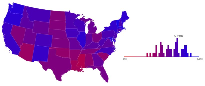
As a first blush, the state level is alright (sorry Alaska, Hawaii). Here I’m showing the proportion of the dollars donated to the major candidates that went to Barack Obama.
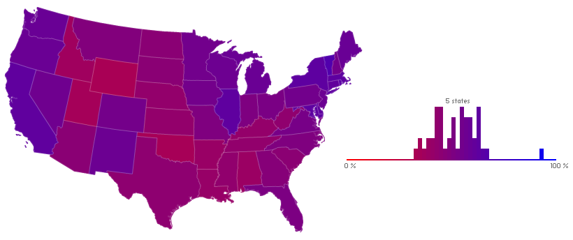
Compare that blue and purple beauty, with only Mississippi to be embarrassed of, with this — the results of the popular vote.
Some of those states were obviously more consequential to the candidates’ finances. Here’s an interactive cartogram, sized by either votes or total dollars. Both cartograms use the 10th densest state as the “anchor unit” (in both cases, New Jersey), so comparisons between the two are meaningful. I talk more about that in my post on noncontiguous cartograms.
The state view is too coarse. The obvious choice is the county level, but such aggregated data is not available from the FEC, nor from the NY Times Campaign Finance API, where I retrieved all the finance data for this post. The data are available as individual records, or as summaries requestable by state or ZIP code.*
So I wrote some Python scripts to retrieve and process all 32,800 ZIP codes available from the Times API. There are more ZIP codes out there, but perhaps they had no donations in 2008. This had to be spread over a few days, because the Times limits requests to 5000 per day per API key.
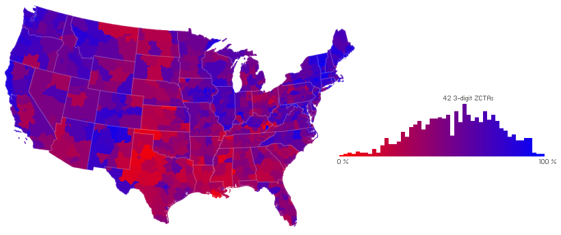
Thanks to the shapefiles available from the Census here I was able to map the proportion of donations to Obama from those 32,800 ZIP codes. But too many ZIP codes lacked donations, leading to an unsightly choropleth characterized by radical change and data-less regions. Best to aggregate to larger units (but smaller than the states above). The NY Times made some nice interactive campaign finance maps, candidate-by-candidate, and aggregated to sub-state regions (ex. “Southern Wisconsin”, “Eastern Shore and northern Maryland”). I’ve settled on a finer unit, the three-digit ZIP Code Tabulation Areas (ZCTAs) of the Census Bureau (an aggregation of ZIP codes based on their first three digits). These first three digits correspond to the sectional center facility of the USPS that serves the area. Though that sounds rather arbitrary, the Census Bureau has aggregated to such units in some of their data since 2000. The following shows donations originating in the 877 three-digit ZIP code regions of the U.S.A., using the same color scheme as the maps above.
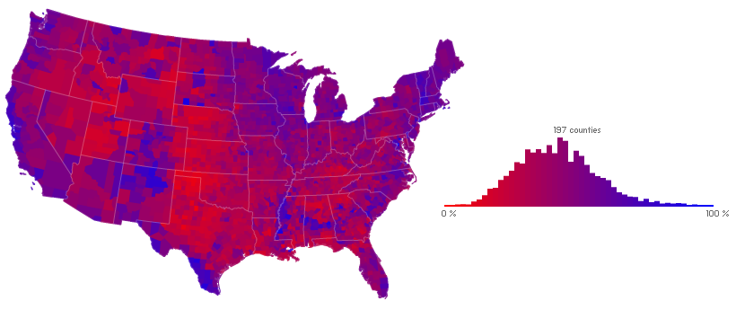
As above, compared to the outcome of the popular vote (but by county):
I’ll spare you the ZIP code regions noncontiguous cartogram. Cartograms rely on the recognizability of features on the distorted image, and 3-digit ZIP code regions lack familiarity save when they happen to line up with county boundaries. A better technique in such cases is described by Andy Woodruff of Axis Maps:
It’s a standard red-blue map indicating the winner of each county in the lower 48 states, where the transparency indicates the population of a county. The many counties with low population fade into the background, diminishing their visual prominence. This is meant to accomplish something similar to a cartogram, where sizes are distorted to show the actual distribution of votes.
Their election maps adapt the technique of encoding uncertainty information in transparency initially suggested by Alan MacEachren in 1992 and refined by Igor Drecki in 1999.
Andy tells me they grouped counties into 16 opacity classes using the natural breaks (Jenks optimization) method. I do the same here for my ZIP code regions. This method minimizes the sum of deviations from class means, thus producing an optimal classification. Sixteen classes ensures the appearance of a smooth gradient of transparencies. I used R and the add-on package classInt to create the classification. Here then: finance compared to votes, with both opacitized by consequentiality (total dollars donated in one case, total votes cast in the other).
And here the same over a white background (thus switching the visual variable representing consequentiality to saturation).
I’ve said very little about what these maps actually show. I’ll let the maps do the talking on that, though please do contact me if you’d like the data used in these maps for your own experiments.
One thing I’ve neglected to mention thus far: all of the above graphics were produced with ActionScript 3, using just a text editor and the latest free Flex SDK. I used Python to retrieve and process the campaign finance data, OpenOffice to paste the processed data into the DBF files of the shapefiles retrieved from the Census Bureau, and R to classify the data. It’s pretty sweet that such visualizations can be created using only free tools and data.
update: As I toiled on my ZIP code detour, it turns out GeoCommons Finder was accumulating the data I craved. As described there: “The monthly individual donor data was downloaded from FEC (Federal Election Commission), geocoded and then aggregated to county level for the lower 48 states.” The data provided there by county will still require some processing and doesn’t cover the full range of the data presented by ZIP code region above, but the common county aggregation makes further comparisons with voting data possible, and I’ll show some bivariate maps utilizing this new data in the near future.
5 Comments
Cool stuff - let us know if you need any help with the data. We’ve done a fair amount of grunt work with the FEC databases. Really like the adjusted transparency maps.
best,
sean
heheh :)) , asta a fost buna
I actually tried out to post some sort of opinion before, although it have not found up. I think your own spam filtering could perhaps end up being broken?
Very nice style and design and wonderful written content, nothing at all else we need :D.
After looking at a number of the blog posts on your blog, I seriously like your way of blogging.
I saved as a favorite it to my bookmark website list and will be
checking back soon. Please visit my web site as well and tell me
your opinion.
2 Trackbacks
[...] map is something I have touched on here several times over the past year and a half (as has Zach on his blog), and about which I spoke at last year’s NACIS conference in Sacramento. With the publication of [...]
[...] here is new. I’ve been doing this in Flash for a while — see here and here; and of course Judy Olson was doing it some 35 years ago. But it’s nice to see it working [...]