This summer, I was hired by David Hart, the coastal GIS specialist for UW Sea Grant to build a dashboard for viewing streamflow statistics in the Fox/Wolf rivershed here in Wisconsin.
Given the dashboard approach, I wanted to create something very aesthetically pleasing, flexible, and easy to use. For the data display, I coded a plot similar to that used by Google Finance. This puts all data at the user’s fingertips, and allows them to focus and zoom in on the period of interest. The project is very much in progress, but you can get a sneak peek at my secret development address
As I suggest in the title, this project is easily extensible into a nationwide USGS station statistical viewer. Any of the variables recorded at the nation’s hundreds of USGS stations could be viewed, analyzed, and compared in my data plot. The coding required would be moderate (loading the massive amounts of data quickly would be the tough part). Hmm…
This summer, three of my UW Cartography compatriots and I were hired by Professor David Van Sickle to create an epidemiological visualization showing asthma exacerbations. This all depended on an inhaler he was/is developing. The inhaler (details to follow) includes some capacity to receive GPS coordinates and transmit these to a database.
This real-time data collection requires a visualization system to help epidemiologists and other health professionals understand the data collected. We built such a system. This was my and our first project in Flash CS3 and Actionscript 3.0. It’s still very much in progress, but (when active) you can view the map at our secret development address.
We were very much inspired by two interactive Flash maps. The first is the UW Alcohol Map by Jian Liu and Feng Qi. This brilliantly simple map uses various temporal controls (allowing the user to change the temporal aggregation and composition of the displayed data) to show alcohol-related incidents on the U of Wisconsin campus in 1998/99. The second is the Trulia Hindsight Map produced by the brilliant people at Stamen Design. We were particularly (and obviously) inspired by their histogram, which is incorporated into the play/pause/step and filtering controls of the map. Our visualization tool builds on the Stamen approach by adding sophisticated temporal and data-driven filtering. I must also give big ups to Modest Maps, an interaction and display library written in Actionscript 2 (but luckily available in an AS3 version as well).
My three UW Cartography compatriots, by the way, were Eve McGlynn (initial design), Robert Roth (initial interface design and programming), and Andy Woodruff (programming, along with myself).
wiscMapper was my second Flash project, and quite an improvement as far as I’m concerned. It is still desperately in need of a redesign and was never fully realized. That said, I think it’s pretty cool. Completed in March of 2007.
A few cool features:
- Sparklines when you mouseover counties (shows the trend while you’re looking at specifics)
- Bivariate choropleth with draggable class breaks
- Scatterplot (no mouseover though = lame)
- Play interval with moving average
- Perceptual scaling for proportional symbols using Flannery’s exponent
- Dot density with interactive dot value
- Noncontiguous cartogram based on Judy Olson’s method
One of these days I may get around to redoing this. Or perhaps expanding it into a U.S. Census viewer or something. Oh, and you may have noticed that the load my data option doesn’t work. Not yet!
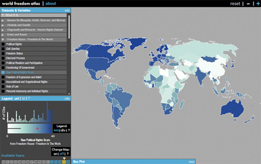
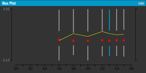
The World Freedom Atlas is a geovisualization tool for world statistics. It was designed for social scientists, journalists, NGO/IGO workers, and others who wish to have a better understanding of issues of freedom, democracy, human rights, and good governance. It covers the years 1990 to 2006. It began as a final project for Professor Mark Harrower’s Geography 575: Animated and Web-based Mapping. I was joined in the early stages by Richard Donohue, Matthew Purdy, and Colleene Thomas, though I took over the project and finished it on my own over the summer. I also owe a big thanks to Andy Woodruff for his help throughout the project.
I was inspired in the early stages of this project by GapMinder World and the World Bank Online Atlas of the Millennium Development Goals. I believe my atlas complements these efforts and extends their approach. The atlas was programmed entirely in Flash 8/Actionscript 2.0 (with a tiny bit of PHP — w/ AMFPHP – to retrieve data from a mySQL database). The data are mostly from the huge Quality of Governance Institute dataset.
The project began in April of 2007 and ended just this month. I’ve been fortunate enough to get a lot of attention from the blogosphere, and have received over 30,000 unique hits as of today. There are dozens of things I’d like to add, change, or improve. Unfortunately I haven’t the time at this point. Please shoot me an email (zach.f.johnson[at]gmail.com), though, if you have any questions, concerns, ideas, issues, etc. about the map.
My third online map and Flash project, streamViz added some interesting tools to my repertoire. I got into the bitmap class. I worked more with Flash’s drawing class. And I included the following interesting features.
- Visual benchmarks give context to a given observation, by showing means, maximums, and minimums for the streamflow data
- Interactive data plot allows user to control maximum and date range
- Continuous color scheme for USGS stations (representing streamflow) can be modified
- 10 years of data at your fingertips!!
Completed April 2007.