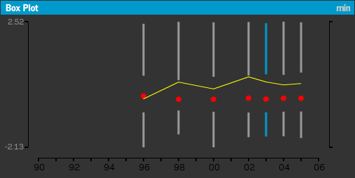
How did Fabian over at Information & Visualization know I was a sucker for effusive praise? Fabian compliments my adoption of the Tufte box plot, combination with histogram, and what I might call a temporal box plot display with superimposed line graph (I’ll need a better name than that) in my World Freedom Atlas.

Still, Fabian offers some reasoned criticism of the Tufteist approach to box plots:
Tufte’s recommendation is based on the notion of avoiding chart junk and the principle of maximizing data ink, i.e. the ink in the drawing should be used to display data and not decoration or junk. While this is certainly a good guideline, it is sometimes difficult to read. In the example of the world freedom atlas, it is only possible to decipher the actual values by looking at the box plot to the left. By maximizing the data ink sometimes the readability is minimized.
Fair enough, I think, though I would argue that the minimalist box plot is necessary in the box plot sequence (otherwise the display would be needlessly cluttered).
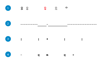
All this reminded me of a small assignment in Geography 572: Graphic Design in Cartography last semester. Having read some Tufte, especially his box plot redesign, we were to come up with a few of our own, presumably ones that drew from the Tufte philosophy, but perhaps exceeded his redesign in some way. Below are my efforts.

My theme was text, and I wanted box plots that could be quickly produced with standard characters. I don’t think any would satisfy the criticism above (nor come close to Tufte’s original minimalism), though the first is helpful in that the actual numbers are used as symbols.