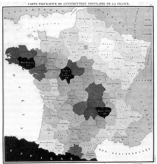
Classification is commonplace in thematic cartography. In choropleth mapping, classification is the norm. This was not always so. The first choropleth map (created by Baron Charles Dupin in 1826) was unclassed.
According to Arthur Robinson, in his Early Thematic Mapping in the History of Cartography:
So far as we now know, the first choropleth map to provide a legend and give class limits to the tones was the 1828 Prussian manuscript map of population density. After the early 1830s most choropleth maps employed classes of various sorts, some based on rankings of the districts, some based on percentage departures from a mean, and some based on categorizing the data itself.
It seems that classification in choropleth mapping was adopted for technical rather than theoretical reasons. Robinson notes that “engravers were unsuccessful in making such [unclassed] maps, since they did not have full control over the darkness of very many flat tones.” Nonetheless, empirical research, begun in the late 1970s and continuing into the 1990s, backed up the decision, at least as regards the acquisition of specific information. Data on the recall of specific information and the acquisition of general information was less conclusive; a good summary of this research is provided in Slocum et al’s cartography textbook.
(classed histogram legend from my first thematic map, produced for Mark Harrower’s Geography 370: Introduction to Cartography)
Range-graded proportional symbols
In proportional symbol mapping, the unclassed form is the norm. This, too, seems to be a technical rather than theoretically-based trend. As noted in the Slocum text:
Classed, or range-graded, maps can be created by classing the data and letting a single symbol size represent a range of data values, but unclassed proportional symbol maps are more common. This might seem surprising given the frequency with which classed choropleth maps are used. The difference stems, in part, from the ease with which unclassed proportional symbol maps could be created in manual cartography (either an ink compass or a circle template could be used to draw circles of numerous sizes).
The logical extension of classed choropleth mapping to proportional symbol mapping was first suggested by Hans Joachim Meihoefer in the late 1960s. Here, too, classification is purported to make the thematic map easier to comprehend; also from Slocum:
Range grading is considered advantageous because readers can easily discriminate symbol sizes and thus readily match map and legend symbols; another advantage is that the contrast in circle sizes might enhance the map pattern, in a fashion similar to the use of an arbitrary exponent…
This comes at the expense of precision, as map reader’s can never get exact values for enumeration units. Borden Dent notes, “In this scaling method, symbol-size discrimination is the design goal, rather than magnitude estimation.”
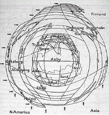
Rarely, though, is exact value retrieval (magnitude estimation) the goal of thematic cartography, at least of the static variety. Further, map readers are notoriously bad size estimators, as an array of psychophysical studies in and outside of academic cartography have established. The graph below (from John Krygier’s excellent blog post on perceptual scaling) sums up the average response to 1, 2, and 3D proportional symbols.
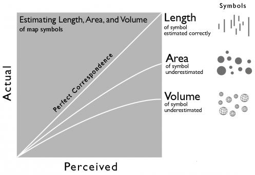
The above suggests that subjects uniformly underestimate the areas of proportional symbols. Perceptual scaling has been developed in response, in which symbol sizes are perceptually scaled according to a power function, rather than being scaled mathematically.
Perhaps more important, though, are the deviations among subjects hidden in the graph above. T.L.C. Griffin, in a 1985 study, found an average underestimation similar to previous studies, but stressed that “perceptual rescaling was shown to be inadequate to correct the estimates of poor judges, while seriously impairing the results of those who were more consistent.”
Both the Slocum et al and Dent cartography textbooks introduce range-grading of proportional symbols as a potential solution to the 1) average poor estimation of symbol size and 2) high deviation in this underestimation.
Cartograms then
This makes a case for classification in proportional symbol mapping. It also makes the case for classification on cartograms. Cartograms can be considered a variant of proportional symbol map in which the symbol shape used is that of the original enumeration unit in some projection. But in my cartogram research for the M.S. Cartography degree at the University of Wisconsin, I ran across no references to classifying the area of cartogram units. A more recent search also revealed no references. Classification seems particularly appropriate to cartograms because the limited research done on their perception suggests that users estimate cartogram feature area much less accurately than the simplified shapes of standard proportional symbol maps.
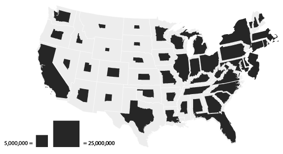
The above is a normal, unclassed cartogram showing U.S. population. Notice the continuous range of state areas, shown below in order of population (but smaller).
Despite the two legend chips, I think it’s quite difficult to estimate the population of states with any degree of precision. The following classed cartogram abandons precision in favor of a more easily and quickly interpreted map.
Exact values can never be retrieved, but each state can quickly be matched with one of four classes (grouped according to Jenks natural breaks classification).
The above maps were created with a beta version of indiemapper. No other mapping software allows the creation of classed cartograms. You can get around this when using tools such as ScapeToad or Frank Hardisty’s Cartogram Generator (both of which utilize the contiguous Gastner-Newman cartogram algorithm) by pre-classing your data, so that only 3-7 unique values are found in the dataset for a given attribute.
In addition to 1) increased discriminability of symbol sizes and 2) a potentially enhanced spatial pattern, classed cartograms may hold a third advantage over the unclassed variety, though only in bivariate mapping. Cartograms, though, are most typically and appropriately employed in bivariate mapping. When constructing a bivariate cartogram, the cartographer sizes enumeration units according to one variable (typically population) and colors the units, choropleth-style, according to some other variable (often election results). In unclassed cartograms, some features may shrink down so as to be nearly invisible, making the reading of the second (coloring) attribute impossible. In the classed variant, a small but still legible minimum size can be established for the first class of data, ensuring that the coloring attribute can be interpreted on all units. A minimum size can be established on an unclassed cartogram, but if mathematical/proportional scaling is employed it may result in absurdly large features at the higher end of the mapped variable.
Of course, classed cartograms won’t always have a larger minimum size; this must be a conscious design decision (in the U.S. cartograms above, the classed cartogram minimum size is smaller than the minimum size found on the unclassed version).
Inappropriate
Classification in cartogram scaling is not always appropriate. Indeed, the typical unclassed form is preferable in many cases. Borden Dent writes the following of classification and choropleth mapping; I believe it’s equally applicable to the proportional and cartogram symbologies:
The purpose of the choropleth map dictates its form. If the map’s main purpose is to simplify a complex geographical distribution for the purpose of imparting a particular message, theme, or concept, the conventional [classed] choropleth technique should be followed. On the other hand, if the goal is to provide an inventory for the reader in a form that the reader must simplify and generalize, then the unclassed form should be chosen.
This sounds a lot like the modern distinction between cartography and geovisualization, or like the older one between communication and represenation. These distinctions have been overblown; experts and amateurs are often looking at the same map. But there are certainly cases where the purpose and audience are more clear-cut. In such cases, classed cartograms may be an option.
While providing the cartographer with the “ability to direct the message of the communication” (Dent), this power comes with great responsibility — specifically the responsible choice of the 1) number of classes, 2) classification method, and 3) appropriate and easily discriminable symbol sizes for each class.
Research on classification in choropleth and proportional symbol mapping has settled on three and seven as the minimum and maximum number of classes that are effective. Classification methods have been much studied in academic cartography, statistics, and other fields. Jenks natural breaks classification is often employed; equal intervals and quantiles are also typical. Cartographers have less guidance on the third choice, that of an appropriate symbol size for each class.
The above shows a set of ten class sizes for range grading developed by Hans Joachim Meihoefer as the result of a visual experiment; the symbol sizes were developed for maximum discriminability, while maintaining a realistic size range (none too small, none too large). Ten classes weren’t recommended, but supposedly any five contiguous sizes could be chosen. Indiemapper uses a slight variation of Meihoefer’s sizing scheme for classed proportional symbol and cartogram sizing.
Despite the additional responsibilities placed on the cartographer, I believe a carefully-crafted classed cartogram can be a very effective representation of some datasets for certain audiences.