E00Parser, an ActionScript 3 parser for the Arc/Info Export topological GIS format

First off, why mess with such a retro format as Arc/Info Export (.e00)?- any code written for this ASCII file type in the last few years has been on how to go from e00 to pretty much anything (especially to the non-topological data format, the shapefile).

Put simply, topological information makes a lot of things possible for the intrepid ActionScripter.

E00 files non-redundantly store all nodes, lines, and polygons that make up a geographic data layer. This geodata format is one of three currently distributed by the Census Bureau for boundary files (the others are the shapefile and the Ungenerate ASCII format). The GIS formats used in most web mapping applications (I’m thinking of shapefiles, GeoJSON, and KML) are non-topological, meaning features are stored independently, and topological information on shared borders and the like is quite difficult to extract. Like seriously hard. Something you don’t want to be doing in the browser. Matthew Bloch, of the NY Times, did his cartography master’s thesis (at Wisconsin, natch) on MapShaper, much of which involved a C++ server-side solution for building topology from a polygonal shapefile. Generalization requires non-redundant polylines so as not to create gaps between features when smoothing. Other visualization techniques, including cartogram construction and graph decomposition, also require knowing the shared borders of geographic features.

Ideally, such topological information could be created/extracted for any geography, regardless of the datasource. In reality, topology building is intensive and best suited to server-side processing. Using E00 files and my E00Parser lets you experiment with the visualization and cartographic techniques only possible when such topological information is known, without the expensive processing necessary to build it.

The code

I’ve gotten a ton of use out of Edwin van Rijkom’s SHP library. My noncontiguous cartogram, isolining, and political choropleth experiments relied on the code to load coordinate data in shapefile form at run-time, as did the early experiments that led to indiemapper. I’m hoping I’ll get just as much use out of this parser, for when adjacency information is critical to the visualization technique.

There are two main classes, E00Parser and E00Tools. E00Parser is based on the Perl extension Geo::E00 by Alessandro Zummo and Bert Tijhuis, with much aid from the (world famous) Arc/Info Export Format Analysis. There’s no way I would have attempted to write the AS3 E00 parser without Zummo and Tijhuis’ code, as theirs appears to be the only stand-alone open source code available for reading the format. Their Perl regular expressions were copied with few modifications, though I did fix an issue in some that was keeping their code from accurately reading certain sections of double-precision coverages. I wrote E00Tools to collect a handful of methods for working with the resultant data.

I setup a Google Code project for this work, as topology will likely form the basis for a decent amount of my cartographic experimentation in the near future.

  • to browse the code, just go here
  • the latest zip distribution is available here
  • three examples are included in com.indiemaps.mapping.data.parsers.e00.examples

Oh, BTW:

ESRI considers the export/import file format to be proprietary. As a consequence, the identified format can only constitute a “best guess” and must always be considered as tentative and subject to revision, as more is learned.

(from the Arc/Info Export Format Analysis)

How to use

After loading your ASCII E00 file into a string, use something like the following to parse it.

var data : Object = E00Parser.parse( e00Text );

The returned data object includes all information contained in the file, and can have as many as nine sections. Of most use are the arc (non-redundant list of polylines), pal (list of all polygons and their associated lines), and ifo (attributes and labels) sections. The exact structure of the returned object is described on the wiki here.

There are three sweet examples to be found in com.indiemaps.mapping.data.parsers.e00.examples.

Tools

E00Tools contains some methods for working with the resultant data of E00Parser.parse(). Included are methods for:

  • Drawing all features
  • Drawing individual features
  • Getting a list of polygon IDs for all features
  • Getting the centroid of a feature
  • Getting the shared border length of all features and their neighbors

Key above is the idea of the feature. Michigan is a feature. Features are not directly encoded in E00 files like they are in other formats. In a polygonal shapefile, for example, each feature is encoded as a multipolygon, constituted of one or more rings of points. In E00 files, only polygons are directly encoded; feature information (which polygons make up which features) can be ascertained from the INFO (ifo) section.

Experimentation

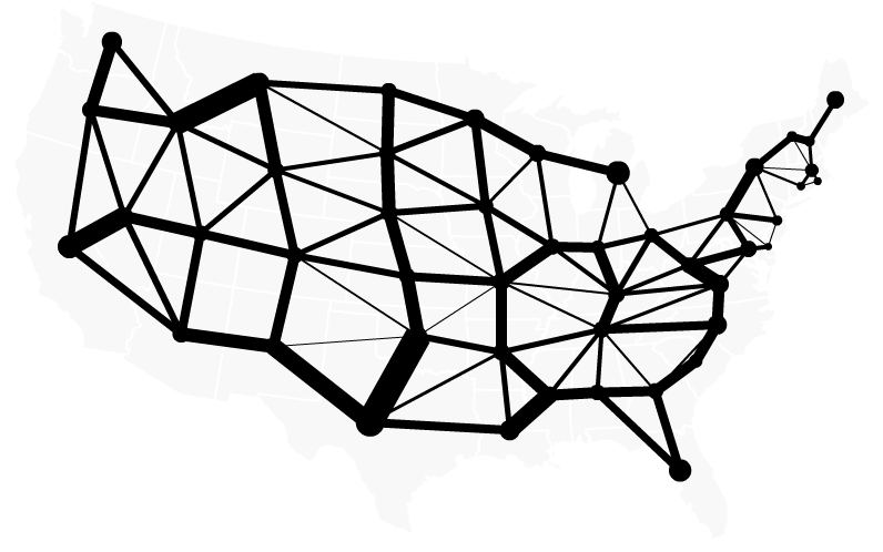
I created these AS3 classes for myself, because I wanted to experiment with topological geodata in visualization and cartographic applications. This typically boils down to knowing which features are neighbors and how much of a border they share. The E00Tools methods getAllFeatureNeighbors and getAllFeatureSharedBorderLengths gives you easy access to this information.

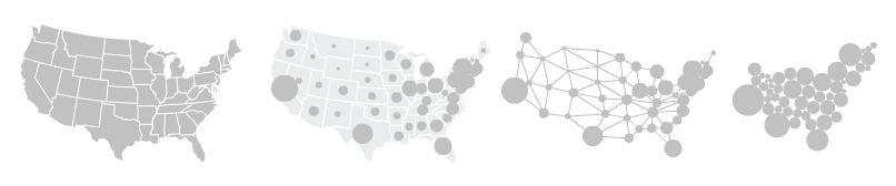
Daniel Dorling popularized the circular cartogram form among academic cartographers, outlining the symbology most notably in his 1991 PhD thesis and 1996’s Area Cartograms: Their Use and Creation (available here in PDF form along with many other gems of quantitative geography). Dr. Dorling made Pascal and C code available. I ported it to Python, and began experimenting, mostly in vain, on a method that worked with a shapefile as input, but without the expense of building topology. It produced at best a pale imitation. Dorling describes the gravity model used to produce the cartograms in his dissertation:

The algorithm which was developed to create the area cartograms worked by repeatedly applying a series of forces to the circles representing the places. Circles attract those they are topologically adjacent to; the strength of this attraction being greater the larger the distance is between them and the longer their common boundary.

The algorithm thus requires the shared border lengths of all features and their neighbors. Producing this info is easy with E00Tools, but it seems kind of backward to parse my geodata in ActionScript only to produce the rendering in Python. I’m working on porting Dorling’s algorithm to AS3 so I can go directly from geodata to cartogram without switching platforms.

Lee Byron mentions another technique, used to generate the Olympic Medal Count cartograms he helped produce for the Times. Byron didn’t release any code, but notes that a soft body force directed layout algorithm written in ActionScript was used. I haven’t been able to reproduce his method, but I’ve included an example that drops the topological information gathered from an E00 file into a Flare visualization using a force directed layout. The example is minimal, but shows how the E00 classes can be integrated with the Flare visualization API, and may point the way to a slightly different method for producing circular cartograms client-side.

political cartography: voting with our pocketbooks

These election maps are kinda late. Here I’m interested in comparing how we, as a country, voted with our ballots versus how we voted with our dollars. Obama received about 70% of the money donated to the major candidates in 2008, but only 53% of the votes, so I expected a bluer map. But I wasn’t sure what the spatial distribution of the difference would be.

As a first blush, the state level is alright (sorry Alaska, Hawaii). Here I’m showing the proportion of the dollars donated to the major candidates that went to Barack Obama.

donations to the major candidates in the 2008 presidential election

Compare that blue and purple beauty, with only Mississippi to be embarrassed of, with this — the results of the popular vote.

votes to the major candidates in the 2008 presidential election

Some of those states were obviously more consequential to the candidates’ finances. Here’s an interactive cartogram, sized by either votes or total dollars. Both cartograms use the 10th densest state as the “anchor unit” (in both cases, New Jersey), so comparisons between the two are meaningful. I talk more about that in my post on noncontiguous cartograms.

The state view is too coarse. The obvious choice is the county level, but such aggregated data is not available from the FEC, nor from the NY Times Campaign Finance API, where I retrieved all the finance data for this post. The data are available as individual records, or as summaries requestable by state or ZIP code.*

So I wrote some Python scripts to retrieve and process all 32,800 ZIP codes available from the Times API. There are more ZIP codes out there, but perhaps they had no donations in 2008. This had to be spread over a few days, because the Times limits requests to 5000 per day per API key.

Thanks to the shapefiles available from the Census here I was able to map the proportion of donations to Obama from those 32,800 ZIP codes. But too many ZIP codes lacked donations, leading to an unsightly choropleth characterized by radical change and data-less regions. Best to aggregate to larger units (but smaller than the states above). The NY Times made some nice interactive campaign finance maps, candidate-by-candidate, and aggregated to sub-state regions (ex. “Southern Wisconsin”, “Eastern Shore and northern Maryland”). I’ve settled on a finer unit, the three-digit ZIP Code Tabulation Areas (ZCTAs) of the Census Bureau (an aggregation of ZIP codes based on their first three digits). These first three digits correspond to the sectional center facility of the USPS that serves the area. Though that sounds rather arbitrary, the Census Bureau has aggregated to such units in some of their data since 2000. The following shows donations originating in the 877 three-digit ZIP code regions of the U.S.A., using the same color scheme as the maps above.

donations to the major candidates in the 2008 presidential election

As above, compared to the outcome of the popular vote (but by county):

votes to the major candidates in the 2008 presidential election

I’ll spare you the ZIP code regions noncontiguous cartogram. Cartograms rely on the recognizability of features on the distorted image, and 3-digit ZIP code regions lack familiarity save when they happen to line up with county boundaries. A better technique in such cases is described by Andy Woodruff of Axis Maps:

It’s a standard red-blue map indicating the winner of each county in the lower 48 states, where the transparency indicates the population of a county. The many counties with low population fade into the background, diminishing their visual prominence. This is meant to accomplish something similar to a cartogram, where sizes are distorted to show the actual distribution of votes.

Their election maps adapt the technique of encoding uncertainty information in transparency initially suggested by Alan MacEachren in 1992 and refined by Igor Drecki in 1999.

Andy tells me they grouped counties into 16 opacity classes using the natural breaks (Jenks optimization) method. I do the same here for my ZIP code regions. This method minimizes the sum of deviations from class means, thus producing an optimal classification. Sixteen classes ensures the appearance of a smooth gradient of transparencies. I used R and the add-on package classInt to create the classification. Here then: finance compared to votes, with both opacitized by consequentiality (total dollars donated in one case, total votes cast in the other).

And here the same over a white background (thus switching the visual variable representing consequentiality to saturation).

I’ve said very little about what these maps actually show. I’ll let the maps do the talking on that, though please do contact me if you’d like the data used in these maps for your own experiments.

One thing I’ve neglected to mention thus far: all of the above graphics were produced with ActionScript 3, using just a text editor and the latest free Flex SDK. I used Python to retrieve and process the campaign finance data, OpenOffice to paste the processed data into the DBF files of the shapefiles retrieved from the Census Bureau, and R to classify the data. It’s pretty sweet that such visualizations can be created using only free tools and data.

update: As I toiled on my ZIP code detour, it turns out GeoCommons Finder was accumulating the data I craved. As described there: “The monthly individual donor data was downloaded from FEC (Federal Election Commission), geocoded and then aggregated to county level for the lower 48 states.” The data provided there by county will still require some processing and doesn’t cover the full range of the data presented by ZIP code region above, but the common county aggregation makes further comparisons with voting data possible, and I’ll show some bivariate maps utilizing this new data in the near future.

Early cartograms

I’m kind of on a cartogram kick lately. I’m interested in the pioneers of the form, those who first thought to distort borders and explode topologies in order to convey the distribution of some thematic variable. When was the first cartogram produced, where, and by whom? I ran into a lot of material while researching my thesis; this post only begins the discussion.

1868

The honor typically goes to Émile Levasseur for the diagrammatic maps contained in his 1868 and 1875 economic geography textbooks.

early diagrammatic map by Levasseur

H. Gray Funkhouser (1937) wrote of these “colored bar graphs”,

squares proportional to the extent of surfaces, population, budget, commerce, merchant marine of the countries of Europe, the squares being grouped about each other in such a manner as to correspond to their geographical position

Interestingly, Waldo Tobler (2004) points out that the example printed by Funkhouser (above) was sized by land area and thus not a true value-by-area cartogram. I don’t have access to Levasseur’s texts, and it’s odd that the only available scan of Levasseur’s first cartogram shows a diagrammatic map, not a true cartogram.

1897

On the other hand is the image below, whose units are definitely sized to the data, but whose geographic arrangement is questionable. I first saw this page from an 1897 Rand McNally Atlas of the World in a SpatialCollective post; a high res version is available from the David Rumsey Map Collection.

a bubble chart, perhaps a circular cartogram, from an 1897 atlas

Circles on the left are sized proportional to population, those on the right to debt. Though the arrangement seems haphazard, geography is not ignored as the circles are grouped together by continent. I don’t really buy these as cartograms, but they’re certainly a predecessor to the circular cartogram form popularized by Danny Dorling nearly 100 years later.

1903

Others refer to the election maps of Hermann Haack and Hans Wiechel as the first cartograms (presumably because the popular example of Levasseur’s earlier technique was scaled by land area). These cartograms, which show election results in the Reichstag, were sized to population and of the same rectangular form as the earlier Levasseur diagrams.

Though these maps are mentioned in the second volume of Eckert’s touchstone history of cartography, Die Kartenwissenschaft (1925), they’re not reprinted there, and I’ve no access to the original sources.

1911

Professor John Krygier dug this one up — perhaps the first American cartogram, and an interesting example of the form.

perhaps the first American cartogram

This is the earliest non-rectangular cartogram I’ve seen of any provenance, and it is unique in maintaining the exact outer shape of the United States, while abandoning unit shape and position.

1929

Grundy

Another early American example, the above map by Joseph Grundy was published by the Washington Post in 1929. States are scaled “on the basis of population and Federal taxes”. Though somewhat rough, I consider this the first modern cartogram, as it maintains topology without abstracting to rectangles.

1934

Erwin Raisz was the first to give cartograms academic attention, describing their production in “The rectangular statistical cartogram” (1934) and devoting significant coverage to the form in his popular cartography textbooks.

rectangular statistical cartogram by Erwin Raisz, 1934

1961

A later example, but still a first. In 1961, Waldo Tobler arrived at the University of Michigan as an assistant professor and began working on the first computer programs for cartogram production. His “pseudo cartograms” were created by expanding or compressing the lat/long grid until the minimum root mean squared error of unit densities resulted.

early computer cartogram by Waldo Tobler

Errors were typically quite high, though likely no higher than those on the manually-produced ones that came before. All subsequent cartogram algorithms can be considered variants of Tobler’s method.